 Nothing too special - just a sketch. It would have been better if I had finished the background. Oh well.I watched Crumb the other day and of course I had to work with a pen.
 DetailNothing too special - just a sketch. It would have been better if I had finished the background. Oh well.I watched Crumb the other day and of course I had to work with a pen.Detail
 Architecture teaches me so much about composition. If you reduced a Frank LLoyd Wright house down to just lines, it would still work as an evocative layout.
 Here's a detail, I love the look of magnified drawings. It's like listening to your favorite song with headphones and hearing the little things, like sounds reverberating in the drums.
 I'm pretty happy with the way this cloth study turned out. I did it quickly and stayed fairly loose (for me at least).
 I've recently been confronted with questions about the meaning behind my work, which leaves me sputtering and grasping. I think what I'm exploring in this series is the sad and beautiful contrast that occurs when cultural artifacts creep out past the oppressive structures of modernity.
 This piece is inspired by, among other things, old Bollywood movie posters. I imagined an historical exploitation film, completely distorted and "dramatized".
 This is the last of the series.
 St.Francis is one of those icons that seems to inhabit interesting places for me. Claire told me a lot about him and how he would live outside and tend to the animals. He seemed like such an interesting and gentle man.
  being ever to have lived, but almost every story in the bible has him scorning non believers with such intensity.
 This was the first piece in an informal series of three.
 Claire and I went on a 10 day meditation retreat at the start of the year. It consisted of around 10 hours a day of meditation starting at 4am, absolutely no talking, and intense back pain. After a few days without books, radio, music, internet, television or conversation, I began to start seeing things in my head. This image came to me on the seventh day I think.
 A departure from the old and rustic.
 If you could hear it, this piece would sound like the little things that happen in a city..but far away and echoey. Footsteps, people talking at a bus stop..nothing too exciting.
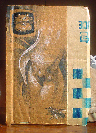 My sister and her husband and I have been exchanging japanese lucky kitties (Maneki Neko) on holidays. I think it's hilarious. The lucky kitty in the corner is one I got Claire.
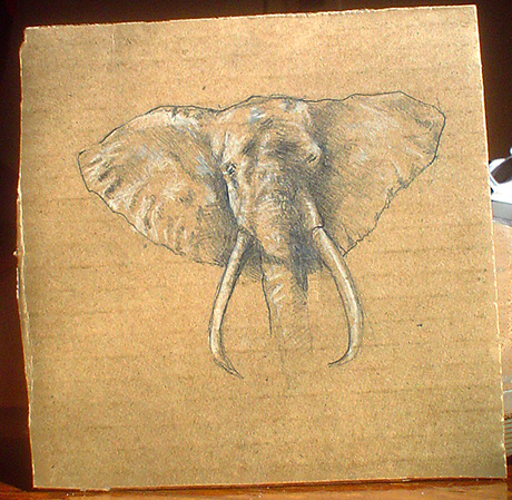 I drew this around 6 years ago I think. I gave it to my dad, who has always had a fascination with elephants. I suppose I recently inherited it. It's nice to have on my shelf.
 Another night in the groupboard. When things are chaotic enough, subjects start to emerge. My friend Sam used to play this game in highschool called "Find the Piggies". He would make sheets of paper covered with dots and hand them out early in the day - the idea being, you find pigs in the midst of the dots - like constellations. It was interesting how the pigs always bore the stylistic traits of the artists.
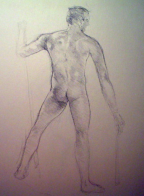 I finally got around to posting the figure studies from the class Scott and I have been going to. Every class goes the same, an hour or so of hating art and not being able to draw at all, followed by an hour of being bored and finally like 20 minutes of decent work, or something like that.The first here was really stressful because he started shaking after around 5 or 10 minutes and after that it was a white knuckle, sweat drenched, bomb-defusion ordeal. I like how the back turned out though. I am trying to get my contour lines to merge better with my shading - right now they seem like 2 different styles stuck in an unhappy marriage.
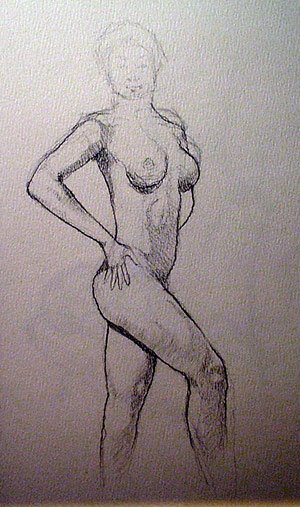 I'm moderately happy with the way this one turned out. I really like the knees - I live for little areas like that. I also got lucky on the hand - even though it looks a little wooden and small - I still like the structure of it. I also really like the way the shading and contours came together, especially on the leg.
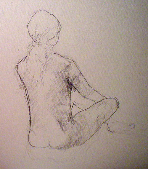 Check out that hair clip and hair texture! It looks like a real illustrator did that part.
 This one is pretty decent. I may go back and watercolor it. The little shading contours didn't come out so well in the pic here but they give the figure a neat wet shiny look. The foot looks too small - I dunno. I spent a lot of time working out the proportions on this one.
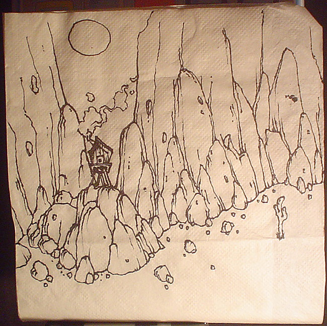 I drew this at a pseudo mexican retaurent called qDoba. I think I got a southwestern influence sitting in there. I seem to be getting a little better with rocks. Some foreground rocks would have been interesting but that requires planning or layers or something.
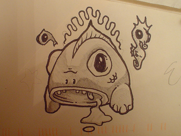 I've been going to figure drawing classes lately (I'll probably post some of those later) and it seems to be making my mental images more vivid. The other day I kept seeing all these cartoons in my head and they all had this dead fish eyed look.
 This is a study for a painting I would like to attempt. Scott (who never posts) and I found a collection of shelves that we decided would make a great base for a collection of paintings. If you look with a careful and heartless eye you can see the errors in proportion when I went from the thumbnail to the full size sketch. Hopefully these are the kinds of issues I can now avoid when i go to the 11 x 40 shelf.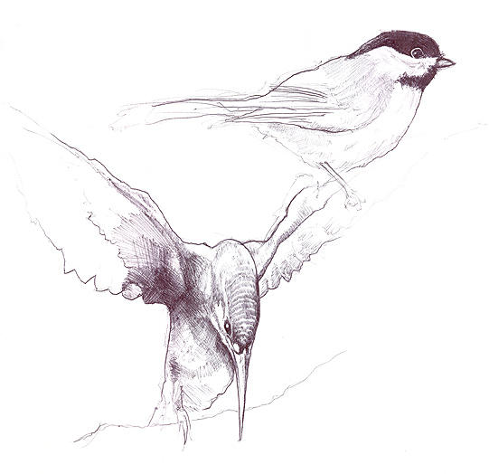


 RSS Feed